There is no shortage of decorating inspiration for kitchens, bedrooms, bathrooms or living rooms. But what about the awkward in between spaces? Hallways can offer a whole host of quirks and obstacles – narrow corridors in particular often end up lacking in light, neglected and bare. Well, if we don’t spend much time there, is it really worth the effort? Yes.
In the UK, we are blessed with a plethora of characterful Victorian and Edwardian semi-detached and terraced houses. Although long skinny corridors with high ceilings are commonplace in these properties, giving them a sense of style and identity is no easy feat.
So, if you’re looking for a long thin blog post about long thin spaces, you’ve come to the right place. Here are a few design tricks that will brighten up even the darkest of corridors.
DISPLAY

The style of your entrance hall will of course make a first impression. It’s an opportunity to create a welcoming feel and tell your guests a bit about you. As shown here, books look instantly homely and reveal something about the person who lives there. But they can also add colour, becoming a design feature as well as a storage solution.
This Swedish home is owned by photographer and shop owner Sofia Jansson and musician Kristo Jansson. For their entrance hall, the couple created an eye-catching wall from a series of paperbacks, lined up on shallow shelving. The white backdrop also provides a canvas for additional personal touches. A vintage cabinet houses a collection of candlesticks, a simple black stool is slimline enough to not take up too much floorspace and some casually propped up pictures add to the effortlessly chic Scandi feel. See more photos of Sofia’s home on Design Sponge.
●
FLOOR TILES
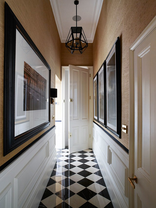
This narrow hallway in an elegant West London townhouse by Elspeth Lynn Design provides an ideal place to hang a gallery of large framed artworks. The ‘corridor effect’ is broken up due to the low hung statement pendant light and white painted panelling, contrasting with the wallpaper above.
The chequerboard tiles are also working their magic, as a patterned floor laid on the diagonal is said to make a space feel larger. There is also a high shine on the flooring, which bounces more light around what would otherwise be a dark space.
●
MIRRORS
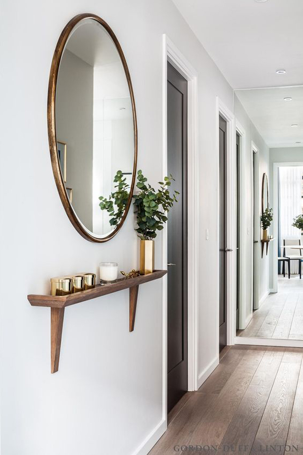
This interior forms part of the The Maple Building in London’s Kentish Town, designed by Gordon Duff Linton. A mirror at the end of the space reflects the window opposite, bringing in ample light, while the wall-mounted round mirror and shelf also creates interest without imposing on the space.
●
COLOURFUL RUNNERS
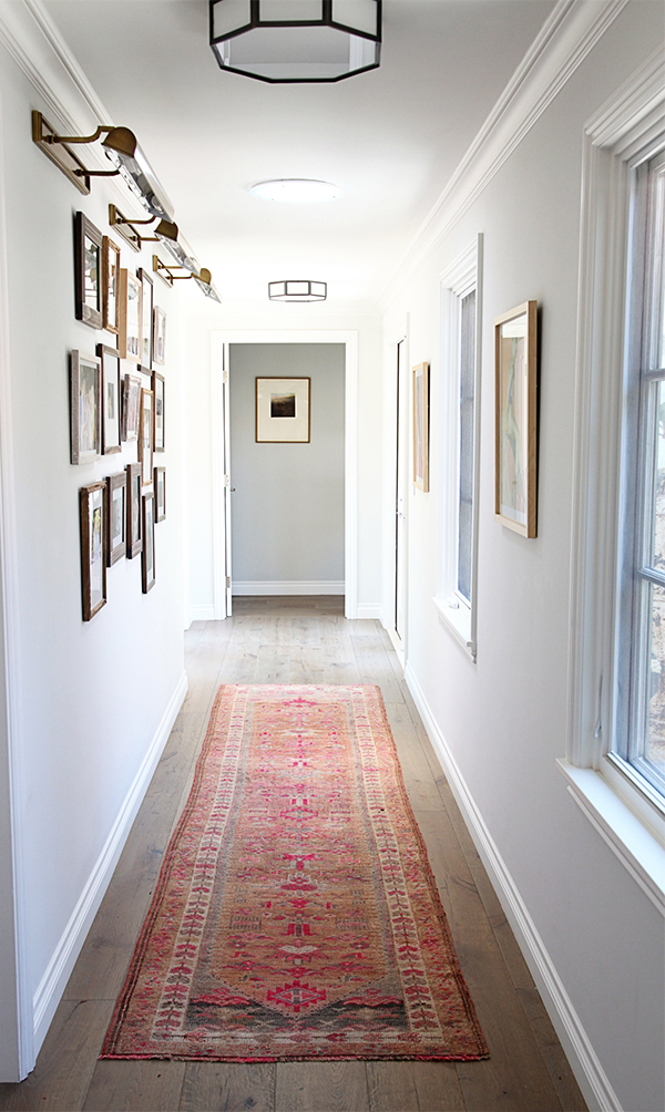
A vibrant patterned runner has to be the simplest solution for brightening up narrow corridors and hallways. This family home was designed with the help of Irene Lovett of Design Stiles with decor inspired by the owners’ love of Napa and Ojai, California. This red rug is the perfect accessory for freshening up an otherwise nondescript space. Find similar on Etsy. Photo by Sabra Lattos.
●
BLACK MAGIC
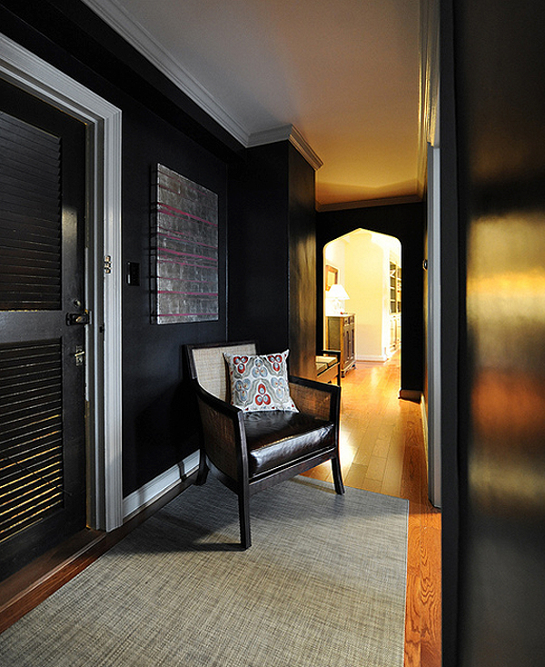
Black walls..? Are you MAD!? Well, maybe. There are many contradicting views on when and where you can get away with dark colours on walls. But ‘design rules’ are made to be broken, right?
Ultimately, it’s down to what a space is intended to be used for. If an area is so devoid of natural light that painting it bright white won’t improve the situation, you could opt for something richer and deeper, that adds a bit of drama to your home. Dark walls in the bedroom or living room might be a bit too oppressive for some. But a thoroughfare is is not somewhere you’re likely to hang out in for long periods of time, so it’s a good place to experiment with something daring.
This project was put together by Annie Elliott of Bossy Color and the hallway features Black Shagreen wallpaper by Schumacher.
●
ACCENT WALL
Another benefit of dark walls, is that they can provide a fabulous backdrop for artwork in lighter coloured frames. In this hallway, designed by Shift Interiors, one of the walls has been left white which makes the space appear wider.
●
DARK CEILINGS
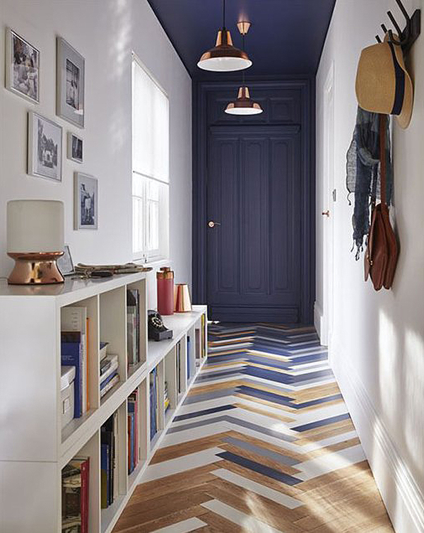
In this hallway, spotted on The Blog Déco, a strong aesthetic is established from the minute you walk through the front door. The dark painted ceiling, copper light fittings, and displayed personal items make the space feel less long and tall. Painted strips of Hungarian oak parquet flooring add a graphic and playful feel.
●
SHALLOW SHELVING
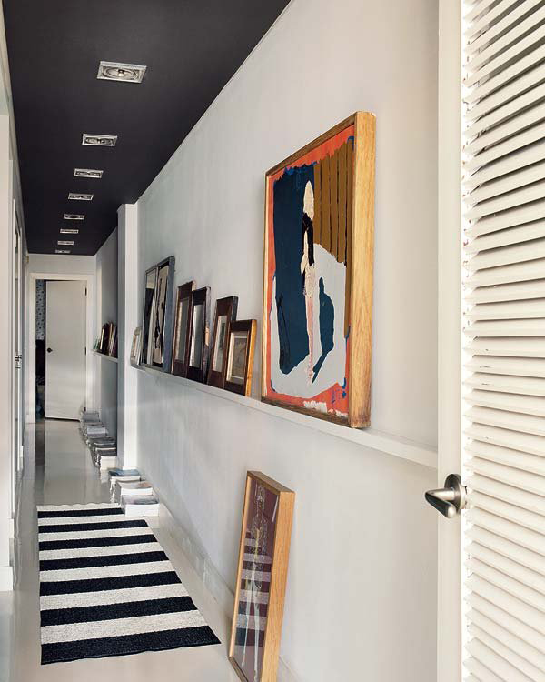
Another example of a dark ceiling in action. In this beautiful Bilbao house overlooking the Guggenheim, the dark ceiling and patterned floor alter the perceived shape of the space. Horizontal stripes also create the illusion of width, making the hallway look less tall and thin.
In addition, a shallow shelf runs along the middle of the wall, providing the perfect place to prop up paintings of different sizes. Piles of books and magazines on the floor also distract the eye. Image via Elle Decor.
●
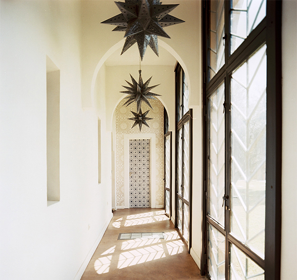
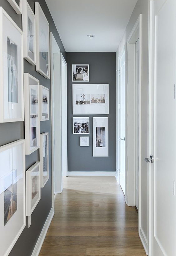
THE GALLERY
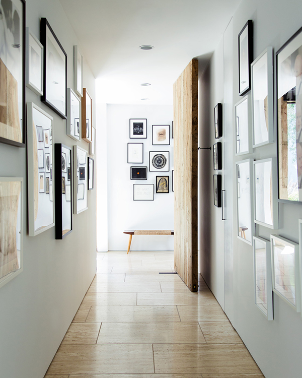
Narrow corridors can be the best place to introduce a flurry of picture frames and create a gallery of family photos. In this home, there is also plenty of reflection coming off the glass which along with the neutral coloured tiles, bounces light into the space. A huge wooden feature door and another eye-catching set of frames on the wall ahead completely transforms an otherwise underwhelming space. Image via Lonny Magazine.
●
FOCAL POINTS

Take inspiration from the home of designer Tami Ramsey, co-founder of Cloth and Kind. As you pass down this corridor, a blue painting directly in front creates the perfect focal point, as does the scene set by table and chair. This is a great trick for creating visual interest and guiding the eye through a long space.
●
MONOCHROME ACCENTS

In this Gothenburg apartment, spotted on Alvhem, graphic elements are created in a whitewashed corridor, not only with the neutral coloured runner, but with the addition of sculptural hooks, bags, shoes, coats and umbrellas. The line of matching black frames hung at eye level is perfect for the space and also happens to echo the rug pattern.
●
LIGHTING
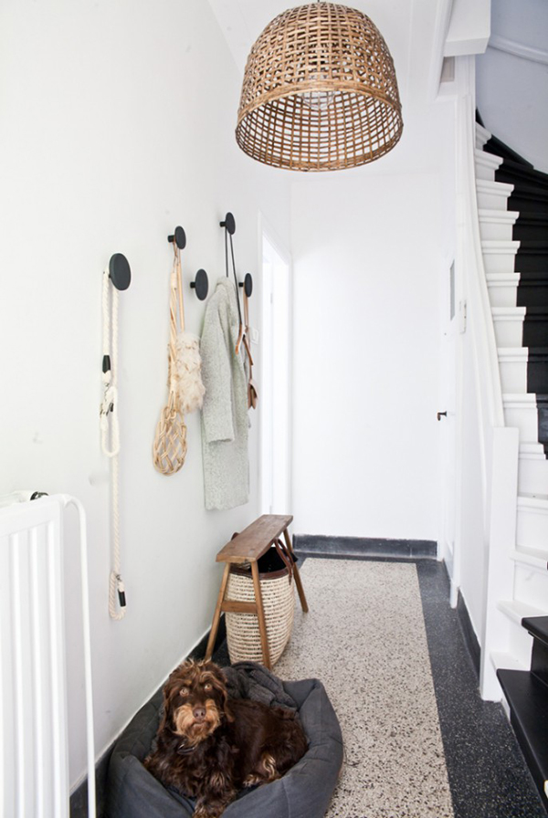
The dog’s face. Need we say more? His name is Puck by the way. But the wicker pendant shade is an equally charming addition to this small entrance hall. This is the home of Fleur Holl of Studio188, as featured on Interior Junkie. The lampshade is made from a basket she picked up at a market in Ibiza. The coat rack was a DIY project and the vintage bench was sourced from a flea market.
●
Photo credits as stated. Opening image via Lonny Magazine.
This post contains affiliate links which means Upcyclist may make a commission, should you decide to make a purchase. Thanks for supporting Upcyclist.co.uk.


